The Kit Kat rebrand was a multi-year transformation focused on modernizing one of confectionery’s most recognizable brands while preserving its most valuable equities. Beginning in 2022, partnered with Marketing, Consumer Insights, and our external Sterling Brands, we set out to evaluate, refine, and evolve the Kit Kat Visual Identity System (VIS) with a singular goal: increase shelf impact, strengthen brand blocking, improve portfolio consistency, and drive purchase intent without sacrificing consumer recognition.
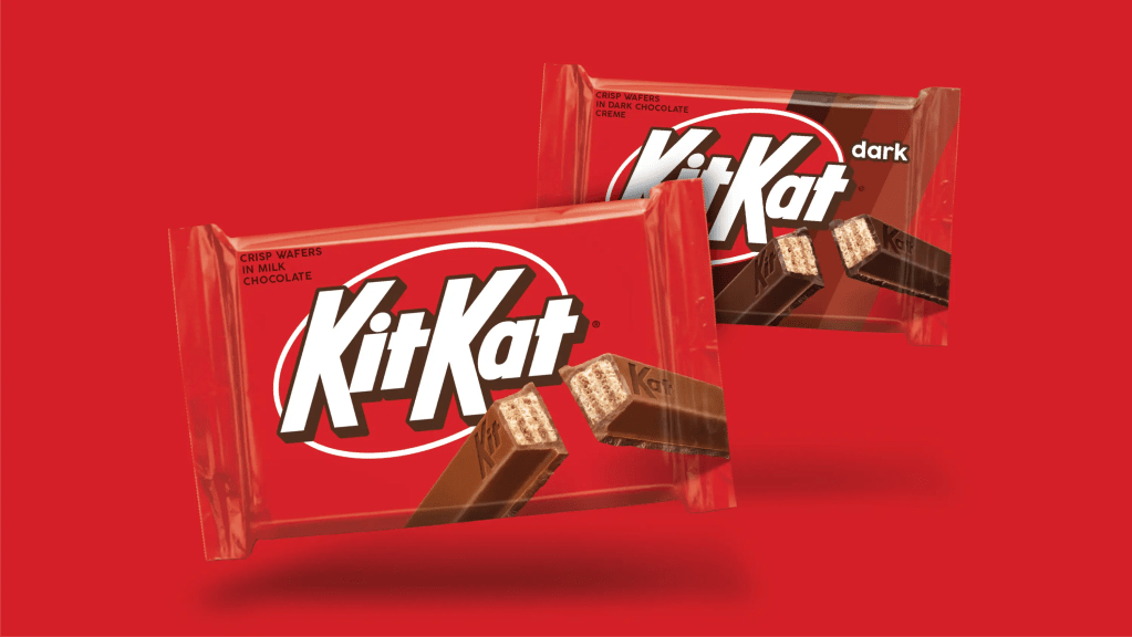
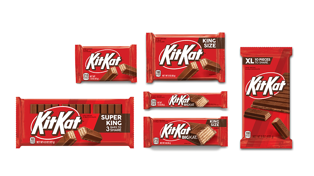
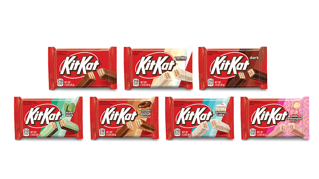
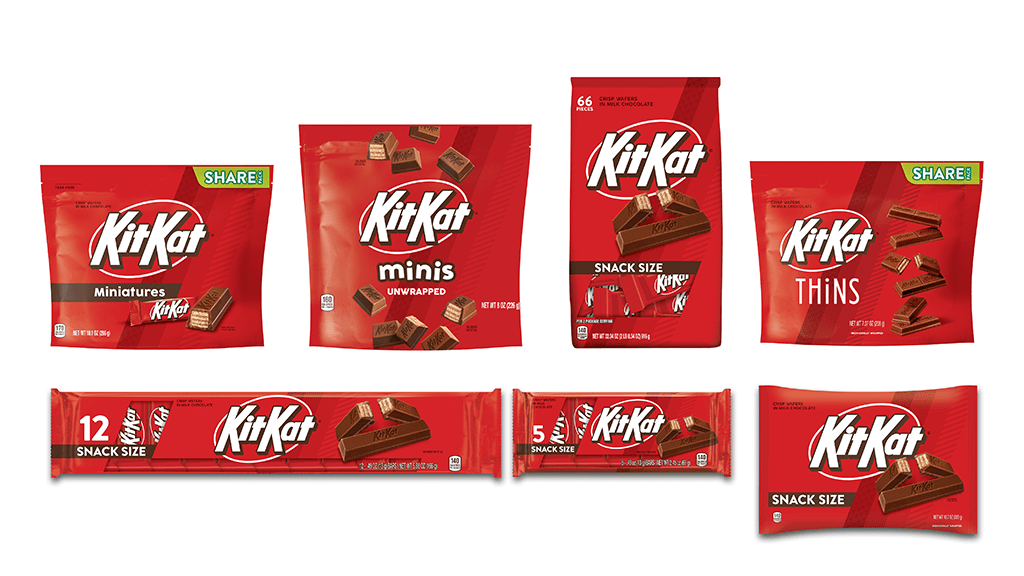
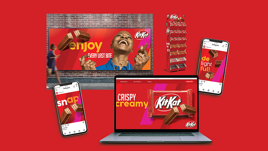
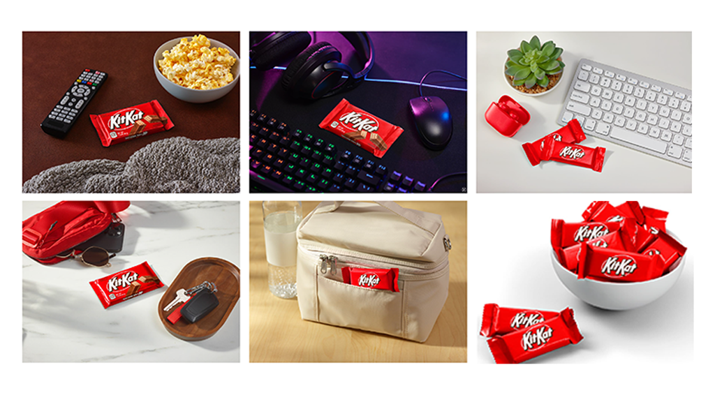
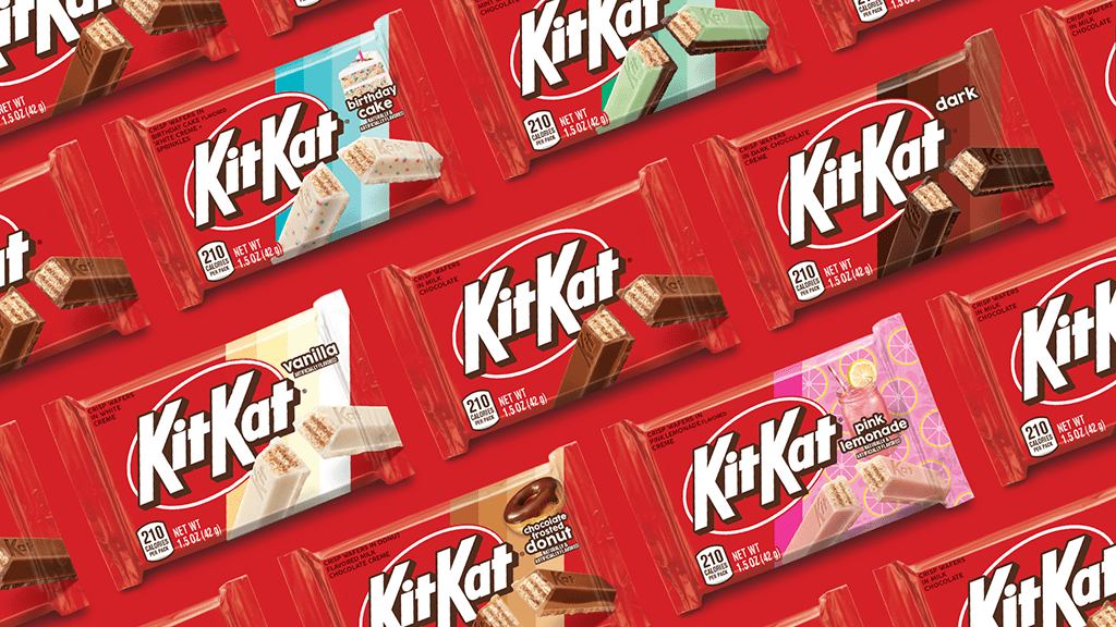
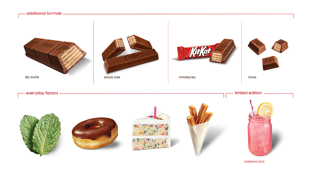
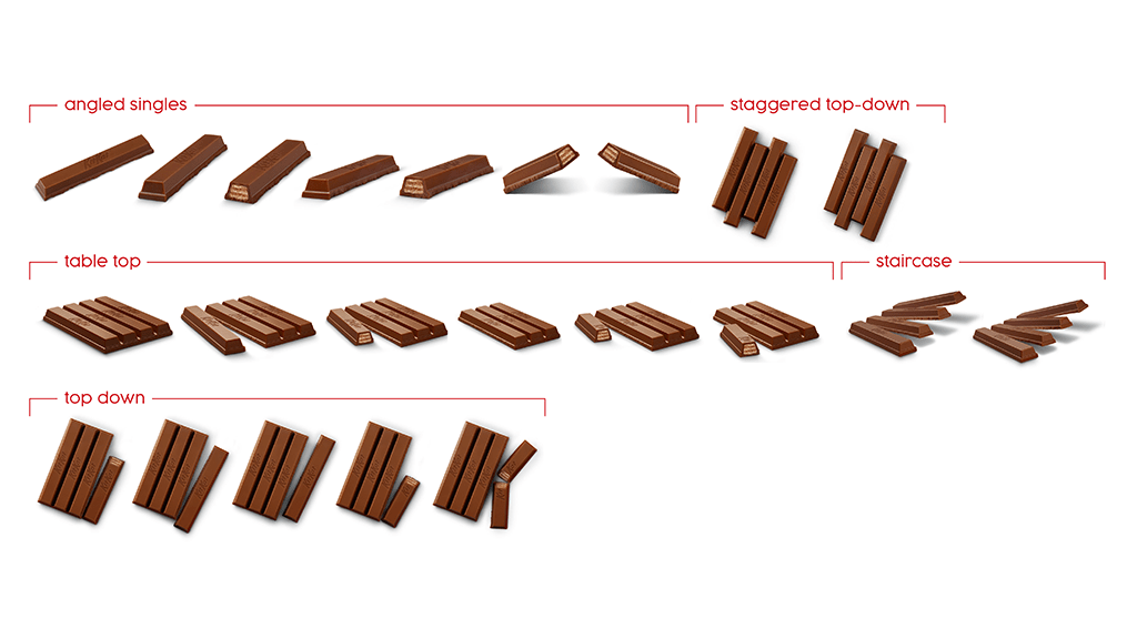
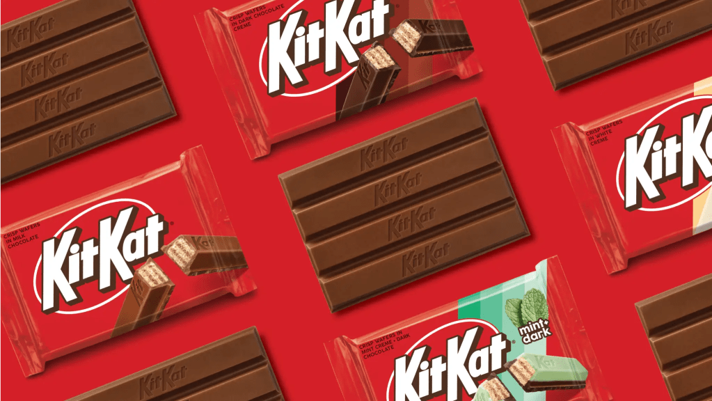
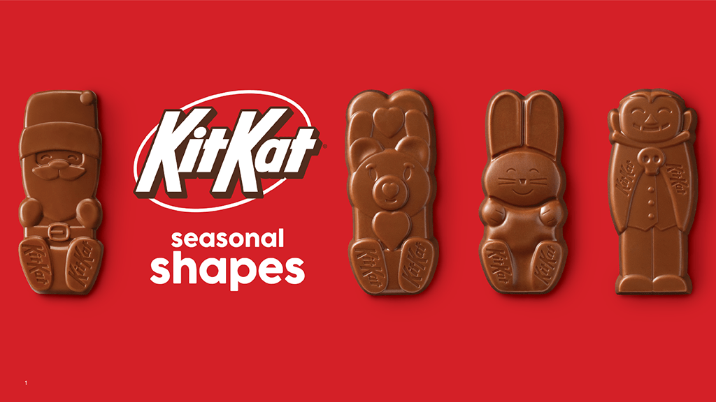

The result was a new Visual Identity System that reinforced Kit Kat’s iconic red brand block, improved appetite appeal, simplified communication, and created a scalable architecture for the growing portfolio. Consumer testing demonstrated increases in purchase intent and improved findability, and the work ultimately earned external recognition as one of Ad Age’s “5 Best Rebrands of 2024.”
– Led all internal design efforts from: design brief, development, research, photography, production, campaign activation
– Partnered cross-functionally with Executive Leadership, Marketing, External Design Partners (Sterling Brands), Sourcing, Packaging Engineering, Marketing Operations, etc.
– Negotiated changes of print methodologies and packaging materials that increased efficiencies, costs savings and print quality.
Resulted in:
– Purchase intent increases of 10% versus current packaging
– Significant improvements in findability for key products
– Stronger portfolio cohesiveness
– Improved shelf navigation and communication.
– Internally, created a platform for future growth supporting new innovations, packaging formats, and marketing activation
– External recognition when Kit Kat was named one of Ad Age’s “5 Best Rebrands of 2024.”

