The Ice Breakers rebrand was a multi-year transformation created to unify the gum and mint portfolio under a stronger master brand and establish a clear, ownable brand meaning. Consumer research and brand architecture exploration revealed a need for greater consistency, stronger brand equities, and a simplified portfolio structure built around the core promise of delivering “a Rush of Icy Cool Flavor.”
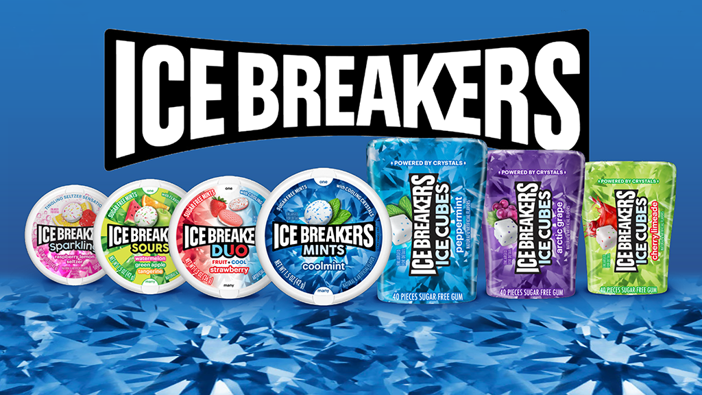
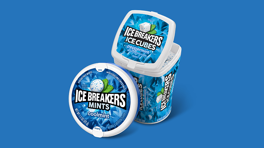
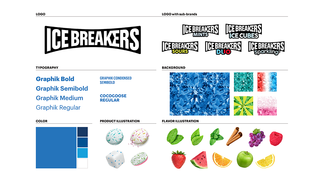
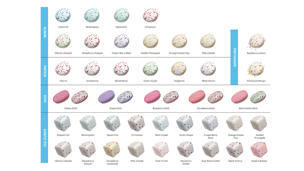
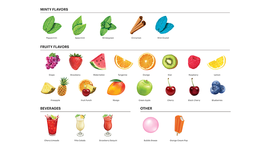
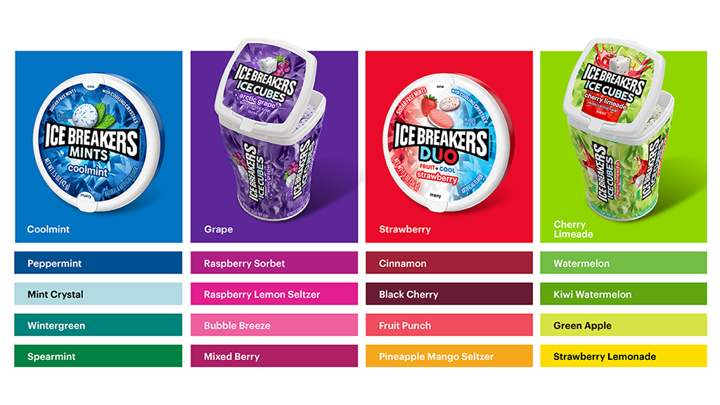
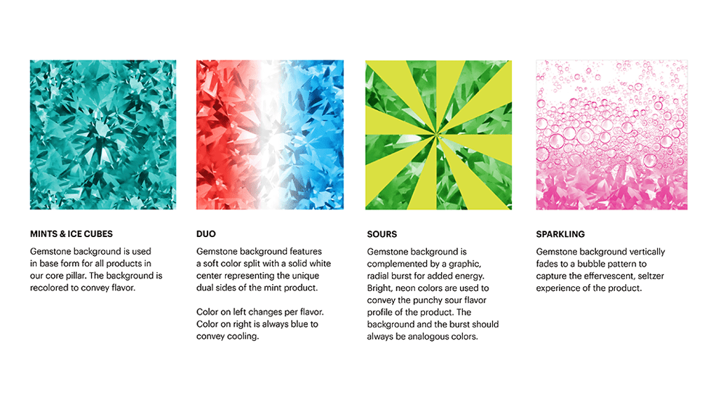
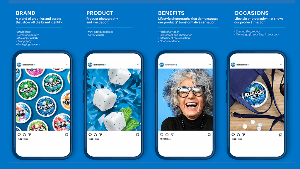
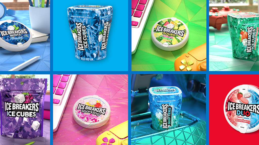
Collaborating with Marketing, Consumer Insights, and our external design partners at Sterling Brands, the team developed a scalable Visual Identity System featuring a redesigned logo, proprietary gemstone background, unified typography, and flexible sub-brand architecture. These distinctive assets created stronger connections across the portfolio while allowing individual product lines to express their unique benefits.
The final Visual Identity System extended beyond packaging into merchandising, digital, social, and future innovation platforms, creating a flexible foundation for long-term brand growth. The transformation also aligned with broader business and packaging objectives, including improved recyclability, manufacturing efficiencies, and updated packaging materials. Ultimately, the rebrand unified the portfolio under a stronger master brand, clarified the relationship between product lines, established a set of ownable brand assets, and delivered a scalable design system capable of supporting Ice Breakers’ ambition to become the leading refreshment brand.
 Mike Pacewicz | Strategic Design